Tuesday, December 20, 2011
Monday, December 19, 2011
Friday, December 16, 2011
Thursday, December 15, 2011
Tuesday, December 13, 2011
Monday, December 12, 2011
Friday, December 9, 2011
hi
hand are useful so i used hands for my project and eyes and lips. I thought this was a easy, times saving project.
Thursday, December 8, 2011
t. mills
fourth day of photoshop
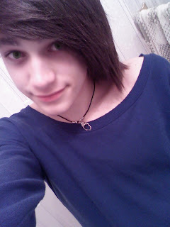
I liked this project because it was easy and i got to stare at t. mills the whole time.
we should do something like this again because it took me like two minutes!
from kristen & taz
I liked this project because it was easy and i got to stare at t. mills the whole time.
we should do something like this again because it took me like two minutes!
from kristen & taz
Tuesday, December 6, 2011
Cinderella can fly up high in the sky
Cinderella can fly
me and kristen thought that the world should know that princesses fly up high too.
me and kristen thought that the world should know that princesses fly up high too.
Monday, December 5, 2011
Friday, November 4, 2011
Brushes. T.Mills
He's hot so I found a picture of him and created a brush out of it. Changed the color and randomly posted it everywhere. I liked this project becasue i got to stare at T.Mills the whole time and he is so beautiful that it made it easier for me to concentrate. It only took me about 5 minutes to finish this project.
Wednesday, November 2, 2011
T. mills (;
This is a picture of t mills. I found a picture of him and made it out of his lyrics. I completely enjoyed this project because i got to stare at T.Mills the whole time. I would definetly do this again. Only thing i did not like about this project was the fact that it took forever to finish and i have the attention span of a five year old so that was a challenge.
Friday, October 14, 2011
Thursday, October 13, 2011
Drugs Daily
Magazine of drugs and other related things. yeah i liked this project because i would read this magazine.
Wednesday, October 12, 2011
Drugs
DRUGS DRUGS DRUGS DRUGS DRUGS DRUGS DRUGS DRUGS DRUGS
DRUGS DRUGS DRUGS DRUGS DRUGS DRUGS DRUGS DRUGS DRUGS
DRUGS DRUGS DRUGS DRUGS DRUGS DRUGS DRUGS DRUGS DRUGS
DRUGS DRUGS DRUGS DRUGS DRUGS DRUGS DRUGS DRUGS DRUGS
DRUGS DRUGS DRUGS DRUGS DRUGS DRUGS DRUGS DRUGS DRUGS
DRUGS DRUGS DRUGS DRUGS DRUGS DRUGS DRUGS DRUGS DRUGS
DRUGS DRUGS DRUGS DRUGS DRUGS DRUGS DRUGS DRUGS DRUGS
DRUGS DRUGS DRUGS DRUGS DRUGS DRUGS DRUGS DRUGS DRUGS
DRUGS DRUGS DRUGS DRUGS DRUGS DRUGS DRUGS DRUGS DRUGS
This is a two page magazine spread that i created about drugs. I made the background trippy, included pictures of some common drugs, changed fonts, warped some of the text, used layer style text, and masked type tool
Thursday, September 29, 2011
Retouching of Alex
 This is Alex. I retouched his pictures, I did not fix too much because i did not want him to look completely fake. Pretty much i removed some of the blemish, smoothened out his face, and changed his eye color from blue to a shade of green. This was a really easy task and it did not take me a long time.
 Monday, September 26, 2011
Aisha
The picture on the left is the original picture and the one on the right is the edited version. The edited version is kinda messed up because i rushed through it but it pretty much sends the large message out. The media literally edits the regular pictures to make them look so different that you cannot even recognize the real models. This girl looks so different she was modified to the extreme, They decreased the size of her hips, legs, her face, arms, inner thighs, her chest and flattened her stomach.
 |
| Before |
 |
| After |
Tuesday, September 20, 2011
Retouching
This picture is retouched. This is not the best retouched picture ever but it is much better than the original picture. I had to restart a couple of times because i screwed up and you can still see some of the areas i messed up on, on the picture. I got rid of her blemishes, smoothened her face/ her hand and played around with her eye color a little bit.
Monday, September 19, 2011
Kaya Scodelario
I retouched this picture of Kaya Scodelaria; and I didn't have to do much. Basically i got rid of her freckles, smoothened her face, and changed the tint of her eye color. It was easier to fix up because her picture was not too bad; if i had retouched another picture it would have taken me a lot longer and i would have to put in more effort.
Wednesday, September 14, 2011
Moon reflection
This is a reflection of the moon and it was pretty easy to make. It looks cool. The only thing i had a problem with was using the gradient tool, but in the end i figured it out. The moon reflection picture is pretty cliche, but i could not think of anything else that would look sweet as a reflection.
Monday, September 12, 2011
The layers
This shows multiple layers on top of one another. I pretty much just added random shapes and patterns onto a black background. I also made the picture look a bit sharp at the end so the colors would stand out more.
Friday, September 9, 2011
Thursday, September 8, 2011
Color wheel
The color wheel in which i used a stop sign and made it into an S shape, gave it a trippy background, and changed the colors.
Wednesday, September 7, 2011
Skater
A skateboarder with the colors red, yellow, and green blended in. It looks cool, and this project and short and fun.
Thursday, September 1, 2011
Animals
- Turtle - Green, shell.
- Tiger- Fur color, long tail, Stripes.
- Seahorse- rings around the body, tail, different shades of color.
- Jellyfish- umbrella shaped body, tentacles.
- Penguin-"Wings", webbed feet, round bodies.
- Kangaroo- pouch, legs.
- Polar bears- Pure white, completely furred.
- Hippopotamus- Barrel shaped bodies, short legs,
- Rabbit- Fur, long ears, white, black, brown.
- Dinosaur- scaly skin with patterns, green or brown.
Wednesday, August 31, 2011
Frog Tongue
I think that the idea of this picture is pretty awesome. My piece is not too bad but it is definetly not a success because some parts of the picture is kind of rough. The part that worked was me placing the frog on top of the tongue, but it did not blend correctly so i think it looks a little unrealistic. Blending it in was the most difficult. If i did this project over again I'd replace the frog with something more cool. I learned to change shapes of a certain picture by combining a different picture.
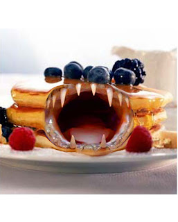
Angry pancake
 My exact thought is that this is going to be bad and it will look horrible. My piece isn't very successful but it probably is not too bad. The jaws look too huge and do not fit in with the pancake that was a fail, but the rest of the editing looks pretty normal. I probably would not do this project over again, I'd completely change it and do something other than a pancake with jaws. The most difficult part would be placing the jaws into the pancake because the size of the pancake is small and the jaws are huge; It does not fit. I learned to combine pictures in this project.
Subscribe to:
Comments (Atom)


